

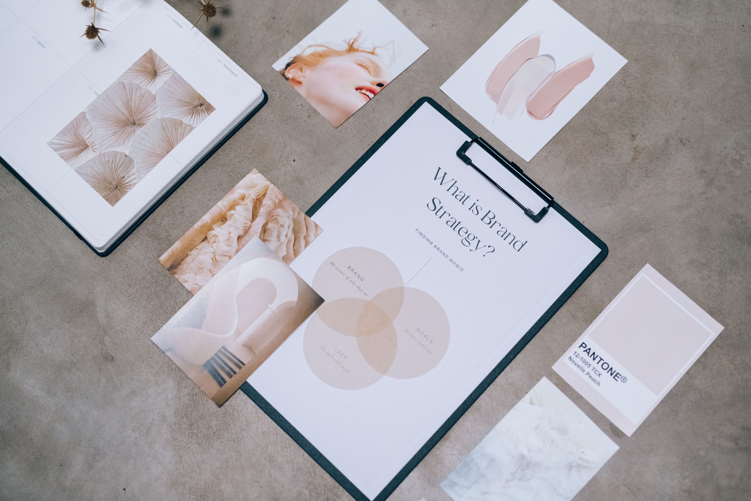
Branding is not your logo, your colors, or your tagline. It is the feeling people get when they hear your name — and for a small business, it is often the only advantage you have against bigger competitors. You build a brand with consistent choices: the way you write, the way you answer the phone, the way your website feels. This guide shows you how to build that consistency on purpose, without a big agency budget.
What Branding Actually Means for a Small Business
Big companies spend millions on brand campaigns because a strong brand lets them charge more and lose fewer customers to competitors. Small businesses can do the same with far less, because your audience is smaller and closer to you. Every interaction you have — an email, a delivery, a reply on social media — is a brand moment.
Your brand is the set of expectations people have about you, and you get to set those expectations or leave them to chance.
Brand vs Logo vs Identity
These three words get mixed up constantly, and the difference matters:
- Logo — the mark that identifies you. It is one element, not the brand itself.
- Visual identity — the full set of visual choices: colors, fonts, imagery, layout style. It is how your brand looks.
- Brand — the reputation, personality, and feeling. It is what people say about you when you are not in the room.
Most small businesses start with the logo and stop there. That is like writing your name on a door and calling it a reception desk — a start, but not the experience.
Start With Positioning: Who You Are For and Why You
Before any design work, you need to answer two questions: who are you for, and why should they pick you? Positioning is the short answer to both. It guides everything downstream, so it deserves real thought, not a brainstorming session that ends with a mood board.
A useful positioning statement has three parts: your audience, your promise, and your proof. For example: “We help local coffee shops set up online ordering in under a week, with no IT staff needed.” Audience, promise, proof — all in one sentence.
Find Your Differentiation Without Copying Big Brands
Small businesses often try to sound like the big player in their industry. That is a mistake. A two-person studio cannot win on scale, so it should not pretend to. Your differentiation lives in what a big company cannot easily copy: your expertise, your speed, your location, your story, your way of working.
Write down three things you do differently from the biggest competitor you can name. If those three things are not visible on your website, you have a brand problem — and fixing that costs nothing but a rewrite.
Building a Visual Identity You Can Actually Maintain
Visual identity only works if you can keep it consistent across everything you produce. The best identity for a small business is not the most creative one — it is the one you can sustain. A palette of three colors, two fonts, and one image style is enough to be recognizable.
Colors: Fewer Is Better
Pick a primary color, a secondary color, and a neutral (usually white, off-white, or dark gray). That is your palette. Use the primary for actions and highlights, the secondary sparingly, and the neutral for everything else. If you already have a logo with colors you like, start from those instead of inventing new ones.
Typography: Two Fonts Maximum
One font for headings, one for body text. Use a web-safe pairing (like a sans-serif heading with a readable serif body, or two sans-serifs with different weights) so your site, emails, and documents all look related. Fonts are like voices — the more you mix, the less anyone remembers what you said.
Imagery: One Style, Consistently
Choose whether your photos are bright and friendly, moody and premium, or clean and minimal — then apply that choice to your website, social media, and packaging. Inconsistent imagery is the fastest way to look amateur, because it signals that no one is in charge of the brand.
Your Voice: The Brand Element Everyone Forgets
Visual identity gets the attention, but voice carries most of the experience. Every email, every product description, every reply to a customer is written in your brand’s voice. If your website is formal but your emails are chatty, people notice — even if they cannot name what feels off.
Define your voice with three adjectives and one thing you will never say. For example: “practical, warm, direct — we never use jargon to sound important.” Then apply that filter to everything: the FAQ page, the error message, the thank-you email.
Consistency beats cleverness. A boring voice used consistently builds more trust than a clever voice that changes every month.
Write Your Brand Voice Down
Write a one-page voice guide and share it with anyone who writes for you: a paragraph describing how you sound, a list of words you use, a list of words you avoid, and one before-and-after example. It is the cheapest brand asset you will ever create.
How to Apply Your Brand to Your Website
Your website is where most people meet your brand for the first time, so it has to carry all of it: positioning in the headline, voice in the copy, and identity in the design. It does not require a redesign if you already have a site — it requires applying the decisions above consistently.
- Put your positioning statement (or a version of it) in the first screen of your homepage.
- Use your two fonts and three colors everywhere, including your email newsletter and forms.
- Write your About page in your brand voice, with the proof of your promise front and center.
- Use one image style for all page headers and blog images.
- Make sure your contact page matches the personality of the rest of the site — it is often the least branded page on small business websites.
If you do not know where to start, start with your homepage headline and your About page. Those two pages carry most of your brand in the first visit.
Brand Consistency Checklist (Print This)
Use this checklist quarterly, or whenever you are about to launch something new. If you fail three or more items, fix them before spending money on promotion — you will be amplifying a brand that is not ready.
| Check | What to look for | How often |
|---|---|---|
| Positioning visible | Your audience, promise, and proof appear on the homepage | Quarterly |
| Colors on brand | New materials use your 3-color palette | Every new asset |
| Fonts on brand | Only your 2 fonts appear in marketing materials | Every new asset |
| Voice on brand | No jargon, matches your 3 adjectives | Every new text |
| Imagery consistent | Photos share one style | Every new asset |
| Logo not stretched | Logo used at right size, on clear background | Quarterly |
Print it, stick it above your desk, and treat it like the maintenance schedule for your reputation. Branding is not a launch-day activity; it is a habit.
Frequently Asked Questions
How much should a small business spend on branding?
You can start with zero: positioning, voice guide, and a consistent palette cost nothing but time. If you need a logo, a professional logo design typically costs between a few hundred and a few thousand euros depending on your market. The expensive part is usually website design, not branding itself.
Do I need a brand refresh every few years?
Only when the business changes — new audience, new services, or a reputation that no longer matches reality. A refresh is a strategic decision, not a calendar event.
Can I build my brand on social media before my website?
You can, but you should not. Your website is the only place you fully control. Build your identity there first, then carry it to social media. Posting on social before defining your identity just multiplies the inconsistency.
What is the fastest way to look more professional without spending money?
Consistency. Same fonts, colors, voice, and imagery everywhere — including email and documents. Most small businesses look unprofessional not because their assets are bad, but because nothing matches.
Branding on a Budget: Where Your Money Actually Goes
You do not need a big budget to build a brand that looks deliberate — you need to spend your money on the pieces that last and do the rest yourself. The trap is the opposite: spending a lot on a fancy logo and nothing on the consistency that makes it mean anything.
What Is Worth Paying For
- A professional logo — but only one version of it. A good designer gives you the logo, the color palette, and the fonts together. That combination is the foundation everything else repeats.
- High-quality photos of your real business — real photos of your team, your space, and your work outrank stock photos in trust, and you use them everywhere: website, social, proposals.
- A simple brand guide — one page that captures the palette, fonts, and voice. It turns your brand from something you remember into something your team can apply.
What Is Not Worth Paying For
- Endless logo concepts — the tenth concept is rarely better than the third. Pay for a clear brief and one strong result.
- Trendy design elements — the design trend of the month dates your brand within two years. Timeless beats timely for a brand you plan to keep.
- Branded stationery before the basics — business cards look great and do nothing if your website and voice are not consistent yet.
Spend on the assets you will use in a hundred places, not on the ones you will use once. A photo of your workshop is used in fifty touchpoints; a custom illustration for a single brochure is used once.
| Asset | Worth paying for | Do it yourself |
|---|---|---|
| Logo + palette + fonts | Yes — the foundation | No — the base everything repeats |
| Real business photos | Yes — highest trust return | Only if a phone camera and lighting are enough |
| Brand voice guide | Can be outsourced | Yes — you know your voice best |
| Business cards | Only after basics are consistent | Wait until the brand is defined |
| Trendy visuals | No | Avoid — dates your brand |
Refreshing an Old Brand Without Starting Over
Most small businesses do not need a full rebrand — they need a refresh that removes the inconsistencies that crept in over the years. A full rebrand throws away recognition you have already built; a refresh keeps the equity and fixes the noise.
The Refresh Checklist
- Audit what you have — collect your website, email, social profiles, invoices, and packaging. Note where fonts, colors, and voice disagree.
- Pick the strongest version — when you find inconsistencies, the answer is usually one of the existing versions, not a new invention. Your logo from last year might be better than the version you are using today.
- Apply the fixes in order — fix the website first (most people see it), then email, then social, then print. Each fix makes the next one easier.
- Keep the recognizable core — if people recognize you by a color or a name, keep it. Change the messy details around it, not the anchor.
A refresh typically takes a weekend of focused work, not a month and a consultant. The results are usually dramatic precisely because small businesses drift so much between their launch and their third year.
When You Do Need a Full Rebrand
Only when the business itself has changed: a new name, a new audience, a new range of services that the old identity cannot represent. If a customer who loved you last year would not recognize what you do now, the problem is not your colors — it is your positioning, and no refresh fixes that.
Frequently Asked Questions
How long does it take to build a small business brand?
The first version takes a week: positioning, voice guide, palette, and fonts. Consistency takes longer — a few months of applying the same choices to every new piece. The good news is that you see results long before you feel finished.
Do I need a logo before anything else?
No. Positioning and voice come first, because they tell you what the logo should communicate. A logo made before those decisions is a guess in visual form. Start with the words, then the design.
Can I change my brand later without confusing customers?
Yes, if you keep the recognizable core. Changing the name or the primary color is disruptive; refreshing the fonts, photos, and voice rarely confuses anyone. When in doubt, change the details, not the anchor.
Carrying Your Brand Across Every Channel
A brand that only lives on your website is a half-built brand. The same people who visit your site will see your emails, your social posts, your invoices, and your packaging — and every one of those touchpoints is either reinforcing your brand or eroding it. Consistency across channels is not extra polish; it is the definition of branding in practice.
Email and Newsletters
Your newsletter should be instantly recognizable even before the reader looks at the sender name. Use the same fonts, the same primary color for buttons and links, and the same voice in the copy. The subject line should sound like you, not like a generic promotional template. If a subscriber screenshots your email to show a friend, that is brand consistency working.
Social Media
Social channels have their own visual rules, but your identity travels with you: the same profile photo treatment, the same color accents, the same tone in captions and replies. The most common small-business mistake is being formal on the website and random on social. Pick one personality and let it follow you everywhere — replies included. A customer who sees the same voice in your DMs and on your About page remembers you; a customer who sees two different companies does not.
Packaging and Invoices
Physical touchpoints are the ones people keep. A simple packaging insert with your logo, colors, and a handwritten-style note extends your brand past the screen and costs almost nothing. The same goes for invoices and receipts: use the same fonts and a short line of brand copy instead of a bare template. These are the touches competitors forget, which is exactly why they work.
Run the channel audit once a quarter: open your website, your last email, your latest social post, and an old invoice side by side. If a stranger could not tell they belong to the same business, you have found your next branding project.
Your Next Step
This week, write your positioning statement and your one-page voice guide. You do not need approval from anyone — they are working documents you will refine. Then do the ten-minute brand audit: look at your homepage, your last newsletter, and your last three social posts side by side. If they look like three different companies, you know exactly what to fix first.
Branding for a small business is not about being memorable at any cost. It is about being recognizable on purpose — so that when someone needs what you do, they remember you already.